Tag: science

Is anyone using Projects to deal with their science stuff?

Is anyone using Projects to deal with their science stuff?

How does it compare to having a combination of evernote and github? How does it deal with large datasets? Is it easy to integrate in your workflow? Any reason why I should use this?

Questions, questions, questions…..

#science #data #datamanagement #evernote #github #projects

Projects
Projects is the safe and simple way to manage your research outputs.. With features just for researchers, you’ll have more time for making discoveries.

Skulls of early Homo erectus from the site of Dmanisi, Georgia, are all quite different

Skulls of early Homo erectus from the site of Dmanisi, Georgia, are all quite different

"Together with the fossilized bones of four additional individuals discovered in close proximity, the skulls indicates that populations of early Homo comprised a wider range of morphological variation than traditionally assumed, which implies a single evolving lineage with continuity across continents. "

So who knows, maybe H rudolfensis, H gautengensis, H ergaster and possibly H habilis are all H erectus! If true this would be a game changer as it could indicate that our predecessors at a specific time and place are way less similar to each other than was expected until now.

Read both papers in Science:

http://www.sciencemag.org/content/342/6156/297.short
http://www.sciencemag.org/content/342/6156/326.short

#science #paper #homosapiens #evolution #homoerectus #Dmanisi #palaeontology

 
Big data: US 2010 census racial map

Big data: US 2010 census racial map

Originally shared by +Sander Timmer

The people from the Weldon Cooper Center for Public Service published an awesome piece of big data mapping online. They took the race of each individual American and overlayed that on a map. The result is a stunning map of the States on which you can see clear city block race boundaries that, to me, indicates how badly races are mingling.

http://www.sandertimmer.nl/2013/08/big-data-us-2010-census-racial-map/

#bigdata #census2010 #census #race #map #america #science #socialscience #np

Big data: US 2010 census racial map | Sander Timmer
The Weldon Cooper Center for Public Service published an interesting data rich map online the other day. They took all the US 2010 census data about race and decided to plot that on a single map. Each American is represented as a dot (yes that are many dots!).

Big data: US 2010 census racial map

Big data: US 2010 census racial map

NYC racial data
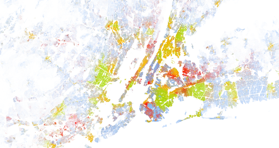
US 2010 census data on race. Each dot is a person and its colour is defined by race.Blue = white, Green = black, Red = asian, Orange = hispanic and Brown = others


The Weldon Cooper Center for Public Service published an interesting data rich map online the other day. They took all the US 2010 census data about race and decided to plot that on a single map. Each American is represented as a dot (yes that are many dots!).

What becomes clear if you go through the map and zoom in/out is how dense populated some areas are and even more how strong the racial boundaries in cities are. You can clearly see on city block level what race is living where and how badly races mingle. See for example the attached screenshot of New York city. You can clearly see the hispanic, the black and the white neighbourhoods on Manhattan island.

Anyway, have a look yourself, be amazed and share screenshot of regions you find interesting:

http://demographics.coopercenter.org/DotMap/index.html

Lobster or crabs don't feel pain? Think again!!

Lobster or crabs don't feel pain? Think again!!

'In another experiment Elwood investigated whether hermit crabs could make motivational trade-offs as a result of pain. They presented Pagurus bernhardus crabs with two types of shell, one of which the animals are known to prefer, and gave some of the animals small electric shocks when they were inside these new homes.

When these crabs were later presented with a new shell they could move into, the shocked crabs were more likely to take up this offer, and they did so more quickly.'

http://bit.ly/178bd3t

#science #crabs #lobsters #pain #animalwelfare