Big data: US 2010 census racial map
Originally shared by +Sander Timmer
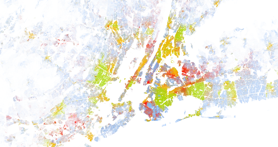
The people from the Weldon Cooper Center for Public Service published an awesome piece of big data mapping online. They took the race of each individual American and overlayed that on a map. The result is a stunning map of the States on which you can see clear city block race boundaries that, to me, indicates how badly races are mingling.
http://www.sandertimmer.nl/2013/08/big-data-us-2010-census-racial-map/
#bigdata #census2010 #census #race #map #america #science #socialscience #np

The Weldon Cooper Center for Public Service published an interesting data rich map online the other day. They took all the US 2010 census data about race and decided to plot that on a single map. Each American is represented as a dot (yes that are many dots!).