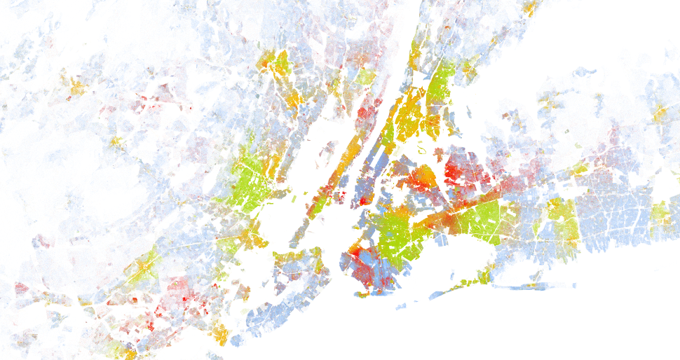
Big data: US 2010 census racial map

The Weldon Cooper Center for Public Service published an interesting data rich map online the other day. They took all the US 2010 census data about race and decided to plot that on a single map. Each American is represented as a dot (yes that are many dots!).
What becomes clear if you go through the map and zoom in/out is how dense populated some areas are and even more how strong the racial boundaries in cities are. You can clearly see on city block level what race is living where and how badly races mingle. See for example the attached screenshot of New York city. You can clearly see the hispanic, the black and the white neighbourhoods on Manhattan island.
Anyway, have a look yourself, be amazed and share screenshot of regions you find interesting: